


Have you ever stood in front of a table full of numbers and tried to understand what the data really meant? In the financial world, it's common to be faced with extensive spreadsheets and complex reports, trying to extract important insights. However, just looking at a series of numbers doesn't tell the whole story. This is where data visualization.
In 2020, it is estimated that 2.5 quintillion bytes of data per day worldwide. This immense volume of information creates an urgent need for new ways of understanding and using data effectively. Turning numbers into intuitive graphs and dashboards facilitates analysis and decision-making, allowing anyone to visualize trends, identify patterns and respond quickly to changing scenarios.
In this article, we'll explore what data visualization is, why it's essential in the financial sector and how applying it can transform the way your company uses information. Enjoy the read!
What is data visualization?
Data visualization is the the process of transforming information into visual representations, such as graphs, tables and interactive dashboards. These elements make it easier to understand large volumes of data, highlighting patterns, trends and insights that might otherwise go unnoticed in traditional tables or spreadsheets.
But for data visualization to fulfill its role, it is essential that the data is of good quality. Inaccurate or incomplete data can distort analysis, leading to misinterpretations and wrong decisions. That's why maintaining the quality of data is fundamental before transforming it into clear and useful visualizations.
Want to understand how to ensure the quality of your financial data? Take a complete learning journey in our glossary!
Why is it important to know how to visualize financial data?
Knowing how to visualize financial data is essential for any professional who wants to make informed and strategic decisions. Here are some reasons why this skill is so important in the scenario of a financier, for example:
Facilitates quick understanding
The financial data can be complex and voluminous. Visualization transforms this data into formats that are easier to understand, allowing professionals to quickly identify trends, patterns and anomalies. For example, a line graph can show the evolution of revenue over time, making it easier to identify seasonality and periods of growth or decline.
Supports decision-making
When data is presented clearly and visually, managers can make more agile and informed decisions. Effective visualizations allow different scenarios to be compared quickly, helping to choose strategies such as resource allocation or budget adjustments.
Identifying problems and opportunities
Data visualization can reveal financial problems that might not have been noticeable just by looking at the numbers. For example, a bar chart showing the costs of different departments can highlight where the biggest expenses are, allowing the finance team to address these areas with cost-cutting strategies. Similarly, visualizations can point to opportunities for growth, such as identifying underexploited market segments.
Effective communication with stakeholders
Finance professionals often need to present information to stakeholders such as investors, directors or other departments. Clear and impactful visualizations make communication more effective, helping to translate complex data into understandable stories. This not only makes it easier to present financial results, but also builds trust and credibility.
Real-time performance monitoring
With interactive dashboards and dynamic visualizations, companies can monitor their financial performance in real time. This is especially important in dynamic business environments, where market conditions can change rapidly. The ability to visualize data in real time allows companies to react quickly to any changes, adjusting their strategies as necessary.
Team engagement and adoption
When data is presented in a visual and accessible way, it is easier for staff to engage with financial information. This can lead to a more data-driven organizational culture, where decisions are made on the basis of informed analysis and not just intuition.
What are the risks of poor data visualization?
For finance professionals, ineffective data visualization poses serious risks that go beyond a simple poor visual presentation. One of the biggest problems is the possibility of misinterpretation of informationespecially when graphs and dashboards are poorly designed, distorting critical data for analysis.
In contexts where decisions need to be quick and informed - such as investments and resource allocation - a confused or incorrect visualization can result in wrong and potentially damaging strategic choices.
Another significant risk lies in the extensive use of spreadsheetsThe most popular financial analysis tools are those which, although very popular, are susceptible to manual errors. Small slips, such as incorrect formulas or duplicate data, can affect the entire decision chain, compromising the accuracy of the financial analysis.
In addition, poor visualizations can impact the stakeholder and investor confidenceespecially if the information is not clear or precise, making communication and strategic alignment difficult.
The error correction and the need for rework generate wasted time and resources, limiting the efficiency of the finance team. In areas of strict compliance, such as auditing and accounting, inaccurate visualizations can also make it difficult to comply with regulatory standards, resulting in penalties and sanctions for the company. Learn more about the importance of avoiding errors in spreadsheets!
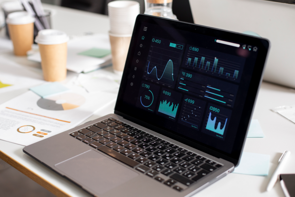
What makes up data visualization?
Data visualization is made up of several elements that, together, transform numbers and their statistics into visual insights. Each component contributes to presenting information in a clear and impactful way. Here are the main elements that make up a good data visualization:
- Graphs and tables: are the basis of data visualization, ranging from line and bar graphs to heat maps and scatter diagrams. Each type of graph serves a specific purpose, making it easier to read and interpret different types of data;
- Interactive dashboards: dashboards that bring together different visualizations in one place, allowing the user to monitor multiple metrics at the same time. Financial dashboards, for example, can include graphs of revenue, expenses and customer growth, providing a complete, real-time view of the financial situation;
- Choice of colors and design: color palette and design play an important role in data visualization, highlighting critical information and organizing content visually. Well-chosen colors help separate information and guide the user's eye to the most important data;
- Explanatory texts and captions: descriptions and legends are essential to give context to visualizations. They help the reader understand what each element represents and make graphics more informative;
- Filters and segmentation options: interactive filters allow the user to explore the data from different angles, focusing on specific periods, categories or regions. This makes the analysis more dynamic and personalized;
- Visual indicators and alerts: icons or colors that indicate variations or results above or below expectations help to highlight areas of attention, facilitating quick decision-making through interactivity.
These components make data visualization a complete and powerful tool, allowing information to be transmitted with clarity, precision and impact.
What are the main types of data visualization?
In addition to the elements, the types of data visualization are varied and each is suitable for a specific purpose. Here are the main types used, especially in the financial context:
Bar and column charts
Ideal for comparing quantities between different categories. They are often used in finance to compare income, expenses or other metrics between periods or departments.

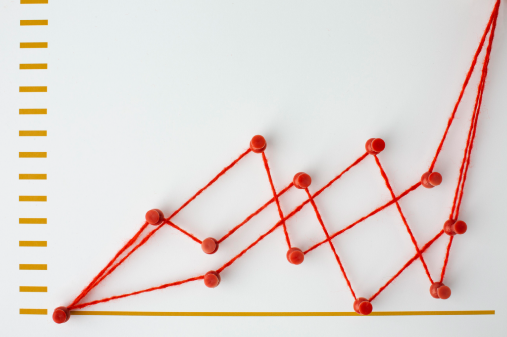
Line graphs
Essential for visualizing trends over time. In financial reports, line graphs help to show the evolution of revenues, profits or costs, highlighting increases and decreases over periods.
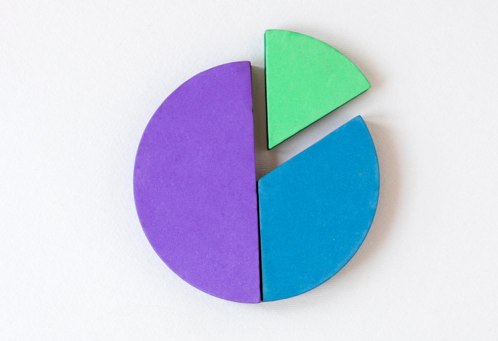
Pie and doughnut charts
Used to show proportions of a whole. Although they are not ideal for comparing many categories, they are effective for showing how each segment contributes to the total, such as the division of expenses.
Heat maps
They indicate intensity with color variations, and are very useful for highlighting areas with higher concentrations of data. In a sales analysis, for example, a heat map can show regions with a higher or lower volume of transactions.

Scatter diagrams
They are useful for showing the relationship between two variables, helping to identify correlations. In finance, they can be used to relate variables such as marketing investment and return on investment.
Dynamic tables
They allow detailed visualization of data in a tabular format, with the possibility of applying filters and sorting. They are ideal for financial analysis that requires an in-depth view of the data.
Dashboards
These are interactive dashboards that combine several views in one place, offering a complete and personalized view. In finance, dashboards help monitor KPIs and other indicators in real time, facilitating decision-making.
What are the main stages of data visualization for finance?
The creation of effective data visualizations in finance goes through several key stages. Each stage helps to ensure that the visualizations convey clear, precise and useful information for decision-making. Below are the main stages:
1. Data collection
The first step is to gather the relevant data for the analysis. In the financial context, this can include data on income, expenses, investments, projections and so on. A collection data needs to be comprehensive and reliable to ensure that the final visualization is accurate.
2. Data cleaning and preparation
Before creating any visualization, the data must be processed. This includes correcting inconsistencies, removing duplicates and filling in missing information. In finance, this step is essential to prevent errors from compromising the analysis.
3. Organization and structuring
After cleaning, the data needs to be organized in a logical and structured way, usually in specific tables or databases. Organizing data clearly makes it easier to use later in graphs and dashboards.
4. Choosing the type of display
Each type of data requires a specific visualization format. For example, trends are best represented by line graphs, while comparisons between categories can be made with bar graphs. Choosing the right type of visualization is crucial if the data is to be interpreted correctly.
5. Building visualizations
With the type of visualization defined, it's time to create graphs, tables or dashboards. This includes applying colors, defining legends and choosing a layout that makes it easy to read. Tools such as Power BI, Excel and Tableau are commonly used at this stage to customize visualizations.
6. Validation and review
After construction, it is important to review and validate the visualizations to ensure that they represent the data correctly and are free of errors. This review process is essential to avoid incorrect conclusions.
7. Interpretation and presentation
The last stage involves interpreting the visualizations and presenting them in such a way that the financial insights are clear to everyone involved. This is where the visualizations are put into context for the team or stakeholders, allowing decisions to be made based on solid data.
Which methods are useful for data visualization?
There are several methods that help make data visualization more efficient and impactful, especially in the financial sector. Below are some of the most useful methods:
Interactive dashboards
Dashboards bring together several visualizations on a single panel and allow the user to follow metrics in real time, explore data from different angles and customize the visualizations according to their needs. In finance, a dashboard can include indicators for revenue, profit, expenses and other important metrics, all accessible in one place.
Storytelling with data
Storytelling is the use of narratives to contextualize data, making it more understandable and engaging. This method helps to tell a "story" with the information, which makes it easier to understand, especially for audiences who are not familiar with financial data. Presenting data in a logical sequence, accompanied by insights, can transform financial analysis into something more accessible and interesting.
Data segmentation
Data segmentation makes it possible to analyze specific information, filtering by categories such as region, period, type of product or customer. In financial reportsSegmentation helps to understand in detail which sectors or groups are performing best or require the most attention, providing a more targeted analysis.
Predictive analysis
Methods of predictive analysis use algorithms to identify historical patterns and project possible future results. In finance, this method is especially useful for forecasting income, analyzing risks and identifying market trends, helping the company to prepare for future scenarios.
Visual indicators and alerts
Visual indicators and alerts highlight points of attention in financial reports, such as extreme variations or deviations from targets. Specific colors, icons and visual signals draw attention to critical areas, enabling a faster response to emerging issues.
Which tools are essential for visualizing financial data?
In the financial world, where accuracy and clarity of information are crucial, choosing the right data visualization tool makes all the difference. With so many options available, it's it is important to understand which ones best meet the specific needs of the financial sectorWhether for simple analysis or for large volumes of data in real time. Below, we list some of the main ones:
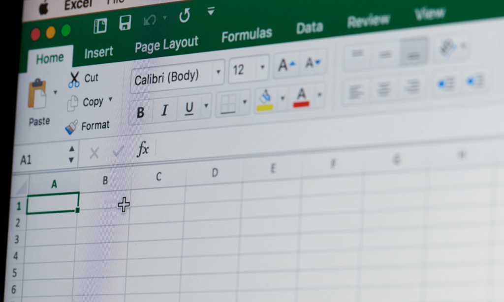
- Microsoft Excel: One of the most popular tools for financial analysis, Excel allows you to create graphs, pivot tables and basic dashboards. Its versatility and easy integration with other systems make it a practical choice for less complex financial analysis;
- Power BI: developed by Microsoft, Power BI is a robust data visualization tool that allows you to create interactive dashboards, make in-depth analyses and share reports in real time. It is ideal for companies that need personalized and detailed visualizations with data from different sources;
- Tableau: Well known in the data visualization market, Tableau offers a wide range of options for interactive graphs and dashboards. Its intuitive interface allows users to create complex visualizations quickly, making it useful for financial analysis of large volumes of data;
- Google Data Studio: Google Data Studio is free and easy to access, allowing you to create interactive dashboards and reports. Its integration with Google Sheets, Google Analytics and other Google tools makes it especially useful for small businesses or teams already using the Google ecosystem;
- Qlik Sense: With advanced artificial intelligence and associative analysis capabilities, Qlik Sense allows you to create interactive visualizations that explore large volumes of data. It is particularly suitable for companies looking for detailed insights and needing more complex data analysis;
- D3.js: a powerful and flexible JavaScript library for customized visualizations, D3.js is ideal for development teams that need highly customizable visualizations. Although it requires programming skills, it allows you to create graphs and visualizations that are completely adapted to your company's needs.
These tools are essential for transforming financial data into clear and useful visualizations, facilitating analysis and strategic decision-making. Each one offers specific features and can be chosen according to the level of complexity and the needs of the team.
How does data visualization enhance data-driven financial management with CSC?
In a scenario where companies are dealing with increasing volumes of financial data, adopting a data-driven approach with Shared Services Centers (SSC)) becomes essential to ensure efficiency and cost reduction.
As we saw earlier, data visualization allows finance teams to quickly identify patterns, insights and opportunities, translating numbers into graphs and dashboards that make it easier to interpret and follow up in real time.
With data management centralized by the CSCIn this way, it is possible to align information from different departments, consolidating the financial vision in a clearer and more accessible way. This allows for integrated and optimized management, where decisions are made based on real, up-to-date data.
To help your company implement data-driven financial management and exploit the full potential of CSC, we have prepared an exclusive whitepaper. In it, you'll find the best practices for structuring data-driven financial management, optimizing productivity and reducing costs with the support of data visualization. Do you want to transform efficiency and decision-making in your company? Download now!